What is a hero?
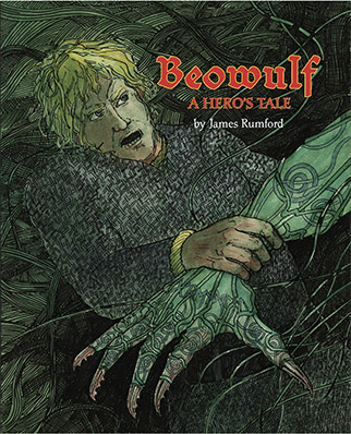
This is the author's edition of Beowulf, A Hero's Tale.
To purchase a copy, click here.
Six years ago, I was minding my own business when a good friend said, "Why don't you do a children's book based on Beowulf?"
People are always giving me suggestions for new books; so I smiled, thinking to myself: No way. I haven't even read that dry-as-monastery-dust poem and don't intend to.
But my friend insisted. She even handed me a cd of Seamus Heaney reading his just published translation. I took the cd home and was mesmerized. Before I knew it, I was reading the original and planning how I could turn a ninth-century poem into a children's book and capture its essence.
I decided from the start that the illustrations had to show how multi-layered the poem was and my retelling needed to offer a glimpse into a bygone world when our language was French-less and Latin-less. This last was tricky because I wanted to retell the poem using only English words that could be traced back to Anglo-Saxon, the language of the poem.
It took six years to figure out the illustrations and to write and rewrite the words so that no one would miss the French and Latin that so pervades our Modern English. And it took a patient editor and an understanding art director to see the project to completion.
How I did the illustrations:
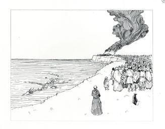
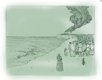
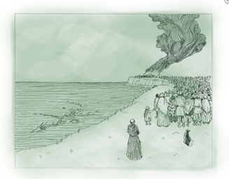
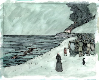
It took me a long time to figure out what kind of illustrations I wanted for this special book. Not until I happened upon the work done by an early twentieth-century illustrator named Arthur Rackham (1867-1939) did I get an idea how I wanted to do the pictures for Beowulf. What Rackham did in some of his illustrations was first to ink in the drawing with waterproof ink. Then he put a sepia wash over the entire picture. Next with a clean brush he lifted off some of the sepia to give his picture tone and depth. Finally, he added color.
Following Rackham’s example, I inked in my drawings. Then, because india ink isn’t as waterproof as it used to be in his day, I photocopied my inked-in drawings on good drawing paper. Next, because I did not want to use sepia, I made up a large batch of a green-colored wash made up of two non-staining watercolors: viridian and rose madder. I painted the entire drawing, then proceeded as Arthur Rackham had done, lifting off the green wash here and there and, when this was dry, adding color.
I should say that I backed the paper and pasted it to a drawing board so that there would be no wrinkles in the paper. How did I do this? First I wet a sheet of thick Japanese paper two inches larger than the drawing on all sides. When the paper had expanded, I put thick paste on these wide margins and stuck the wet sheet onto a large drawing board. When the paper was drum-hard, I brushed paste all over the back of my drawing and stuck it to the dried Japanese paper. I laid a sheet of clean paper over the drawing and burnished the drawing. (The clean sheet of paper protected the wet surface from any marks I might accidentally make with my hand.) Next I put the board up in my studio to dry. In a few hours it was as taut as a drum and ready for me to color.
How I structured the retelling:
In the beginning, it seemed like a simple task. All I had to do was retell the story that the ancient poet had left us. I didn’t have to think of a plot. I didn’t have to wonder what my character was going to do next. All the hard stuff had been done some 1200 years ago. I couldn’t have been more wrong. This is because there are things about the story that I think are difficult not just for children to understand but adults as well.
In the poem, essentially only three days in the life of Beowulf are described: killing Grendel, killing Grendel’s mother, and slaying the dragon. What makes this difficult is that the first two days follow each other in time but the third day takes place fifty years later! Suddenly, in the poem, Beowulf is an old man of seventy or more years! The problem I faced was: how was I going to weld these three days into a cohesive story and create interest and a sense of anticipation?
I decided that words would not solve the problem. The design of the book would have to do the job. It was then I hit upon the idea of having the dragon show up at the very beginning of the book. Instead of being in the picture frames, the dragon would be lurking in the background, writhing and twisting throughout the pages. When it came time for the dragon to make its stage entrance, when Beowulf was an old man, the dragon would leap into the picture frame and be part of the story.
Next, I wanted to underscore the fact that the book is built upon three different events. To do this, I colored the pages dealing with Grendel green. Those about his mother I tinted blue. And those about the dragon yellow. Using color in this way was an effective way of dividing a long story up without having to resort to chapter divisions. (For another use of color, see Tiger and Turtle here, where the color goes from yellow to purple to light green to show the anger as it builds and when it subsides.)
